
By: Lauren Chipman | CEO, with insights from the Chipman Design Architecture Team
Chicago’s Armitage Avenue offers an engaging look at how retail brands translate their identities into physical spaces. Within a few blocks, the Lincoln Park corridor brings together apparel, eyewear, furniture, jewelry, food and service-based concepts, each approaching customer experience differently.
As part of CDA’s Design Month, our team of architects and designers explored several stores along Armitage Avenue. We looked closely at how materials, lighting, merchandising and existing architecture shaped each visit.
The tour reinforced something we see across successful retail environments: design works best when every element supports a clear idea. A store does not need to be elaborate, but it should help customers understand the brand, engage with the products or service and have you feel comfortable in the space.
Faherty: Bringing the Outdoors Inside
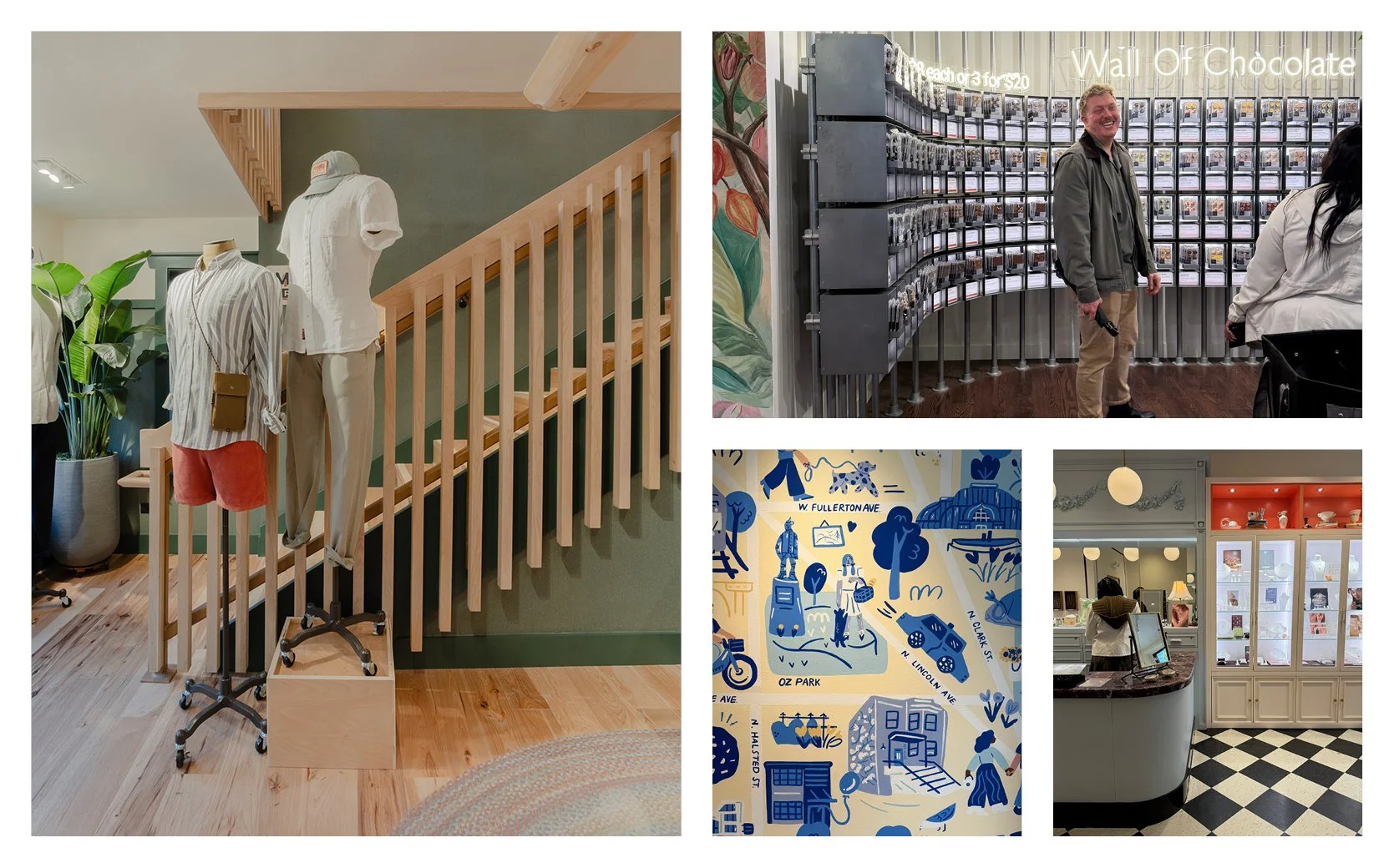
Faherty brought its outdoor-oriented identity into a warm, welcoming retail setting. Natural materials and clean wood details complemented the character of the existing building, creating an environment that felt established rather than overly polished.
The interior showed how architecture and material selection can communicate a brand’s personality without relying heavily on graphics or signage. For our team, the visit was also an opportunity to revisit a space with a direct connection to CDA’s retail portfolio!
Todd Snyder: Pairing Historic Character with Modern Refinement
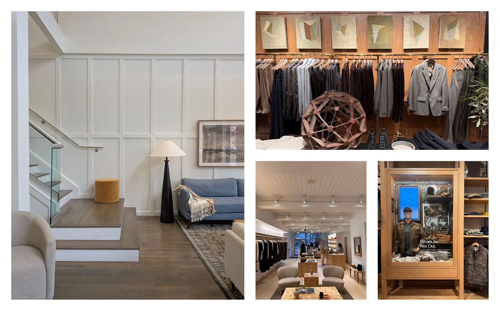
Todd Snyder felt elevated and refined, with the quality of the clothing reflected in the interior finishes. The building’s historic character worked naturally with contemporary materials, while details such as the patterned entry tile, custom gold light switches, millwork and fixtures reinforced the mood of high-end menswear. Even within a tight footprint, the store felt curated without appearing overstocked.
The experience extended beyond what we could see. The fragrance of candles added warmth as soon as we entered, while the friendly, knowledgeable staff made the brand feel approachable and genuine. Architecture, sensory details and personal service worked together to create an environment customers would want to return to.
Moscot: Making Brand History Part of the Experience
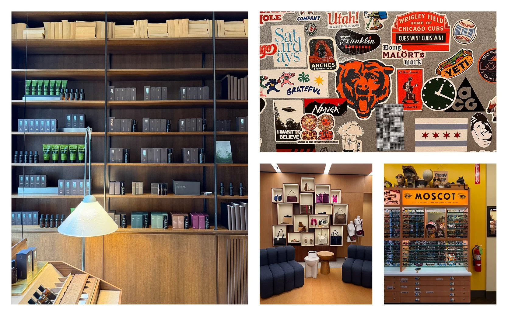
Moscot presented one of the tour’s most layered environments. Gallery walls, wallcovering, vintage references and branded fixtures brought the eyewear company’s history and New York roots into the store.
The visual abundance gave the interior a collected quality, as though it had evolved alongside the brand. There was plenty to discover, but the experience also underscored the importance of balance. Brand storytelling can encourage exploration, while clear merchandising keeps the product at the center.
Interior Define: Working with Existing Architecture
Interior Define offered a light, open environment that helped customers imagine the furniture in a residential setting. One of its most memorable features was the building’s curved concrete-and-brick window.
Rather than hiding the existing condition, the design made it part of the showroom. The curved window gave the space a sense of place that new finishes alone would have struggled to create.
Rothy’s: Connecting the Store to the Product Story
Rothy’s created a clear relationship between its products and physical environment. Large magnetic wood-finish panels supported a flexible display system, while the edited presentation kept attention on the merchandise.
Our team also noted the connection between the flooring and the recycled materials associated with Rothy’s products. The material choices reinforced what the brand makes and values, making that story part of the physical experience.
Buck Mason: Creating a Lived-In Environment
Buck Mason felt less like a conventional clothing store and more like someone’s thoughtfully assembled closet. Apparel was displayed alongside books, music, artwork and collected objects, giving the interior a personal quality.
Warm light and illumination integrated into the shelving helped the products stand out while supporting the store’s relaxed character. The details created a lived-in environment that encouraged customers to slow down and explore.
Huckberry: Blending Outdoor Adventure with Analog Character
Huckberry created an authentic connection to the outdoors through its materials, merchandising and overall atmosphere. The space reflected the brand’s adventurous outlook without feeling themed or overly constructed. Just as important, the people working in the store seemed to live the brand, making the experience feel credible and personal.
Retro details and nods to analog technology added character, while subtle modern elements kept the environment from feeling nostalgic for nostalgia’s sake. The balance of old and new gave the store a strong sense of identity and showed how a physical environment, combined with the people inside it, can make a brand feel genuine.
Hotel Chocolat: Turning Variety into Discovery
Hotel Chocolat created an intimate environment reminiscent of a neighborhood café or bakery. A lower ceiling structure added warmth without making the store feel confined, while a focal table near the entrance helped orient customers.
The illuminated chocolate display showcased the breadth of the selection without making it feel overwhelming. It was a strong example of how lighting and display hierarchy can turn product volume into discovery.
Gorjana: Exploring a Minimal, Contemporary Approach
Gorjana offered a restrained interpretation of jewelry retail. Its minimalist approach shifted attention toward the products and prompted a conversation about how retail environments connect with different kinds of shoppers.
Jewelry brands often need to balance approachability with a sense of occasion. Lighting, scale, materiality and merchandising can help strike that balance. Gorjana reminded us that simplicity is not the absence of design. When fewer elements are present, every choice carries more weight.
Catbird: Using Residential and Vintage References
Catbird brought a residential, vintage-inspired sensibility to its Chicago location. The store reflected the eclectic identity associated with the Brooklyn-based brand and offered an alternative to the feel of a conventional jewelry environment.
We left talking about how lighting, fixtures and color can connect varied elements within a space. Even an eclectic environment needs something that ties the pieces together. Repetition and visual hierarchy can create cohesion without sacrificing personality.
Jenni Kayne: Creating a Refined Residential Setting
Jenni Kayne presented a controlled interpretation of comfort. Its neutral palette, residential furnishings and minimalist styling closely reflected the brand’s understated aesthetic.
The store contrasted with Buck Mason’s more layered environment and raised an interesting question: How can a space feel elevated while still inviting customers to settle in? The answer often comes down to subtle choices involving scale, furniture arrangement, lighting and signs of everyday use.
Clare V.: Expressing a Clear Brand Personality
Located beneath the elevated train tracks, Clare V. made effective use of a compact setting. Cobalt blue zellige tile, graphic midcentury-style posters and playful color gave the store an immediate point of view.
A personalization station added an interactive component and another reason for customers to engage with the brand. We also discussed how integrated shelf lighting could place even more focus on individual products. Clare V. showed how a strong identity can make a smaller retail environment memorable.
Top Drawer: Making Product Discovery More Personal
Top Drawer presented its pens, stationery, artwork, cards and small accessories in an organized, approachable way. Exclusive artwork and cards made specifically for the store gave the assortment added personality, while the ability to try the pens and paper encouraged customers to slow down and interact with the products.
The take-away fact cards accompanying select items were another thoughtful detail. They gave shoppers more context and made the experience informative without interrupting the pleasure of browsing. Small moments of interaction and storytelling gave the products more meaning and made the visit easier to remember.
Rowan: Designing for Trust in Service-Based Retail
Rowan expanded the tour beyond product-focused stores. As a piercing studio, its environment needs to support both brand expression and an intimate personal service.
In service-based retail, lighting, privacy, organization and material condition can shape how customers perceive care and professionalism. These details become especially important when the experience depends on comfort, cleanliness and trust.
Four Retail Design Lessons from Armitage Avenue
1. A Clear Point of View Creates Recognition
The stores we remembered most were not always the most elaborate. They were the ones that carried a recognizable idea through their materials, lighting, graphics and merchandising.
Moscot used history and visual layering. Rothy’s relied on an edited material palette. Clare V. used color and graphics to establish personality. Each created a distinct impression through a different approach.
2. Products Still Need to Lead
An engaging environment can encourage discovery, but it should not compete with the merchandise. Lighting, spacing and display hierarchy help customers understand where to look and how to navigate an assortment.
Integrated lighting at Buck Mason, flexible panels at Rothy’s and illuminated displays at Hotel Chocolat showed how design can make products easier to appreciate.
3. Comfort Is More Than Appearance
Residential furnishings and warm materials can make a store look comfortable, but customers also need to feel welcome interacting with the space.
The contrast between Buck Mason’s lived-in quality and Jenni Kayne’s more controlled environment led us to consider how arrangement, scale and lighting can signal permission to stay.
4. Existing Architecture Can Strengthen the Experience
Armitage Avenue’s buildings contribute character that cannot always be recreated through finishes. Interior Define and Faherty showed how existing architectural features can distinguish a store and connect it to its surroundings.
When those features are thoughtfully incorporated, the building becomes part of the brand experience.
Looking Beyond the Storefront
The Armitage Retail Tour reminded us that customers do not experience architecture, interior design, merchandising and brand communication as separate disciplines. They experience one environment.
The strongest stores aligned those elements around a clear idea. Materials supported the brand. Lighting supported the merchandise. Existing architecture added character. Interactive moments gave customers a reason to explore.
For retailers, the opportunity is not to fit as many design ideas as possible into one space. It is to decide which ideas matter most and carry them consistently through the customer experience.
A physical store allows customers to engage with a brand through space, material, light, service and human interaction. When those elements work together, customers leave with a clearer sense of the brand and a reason to remember the visit.
